
Project 17 · Rentals & sustainability
RNTOUT.
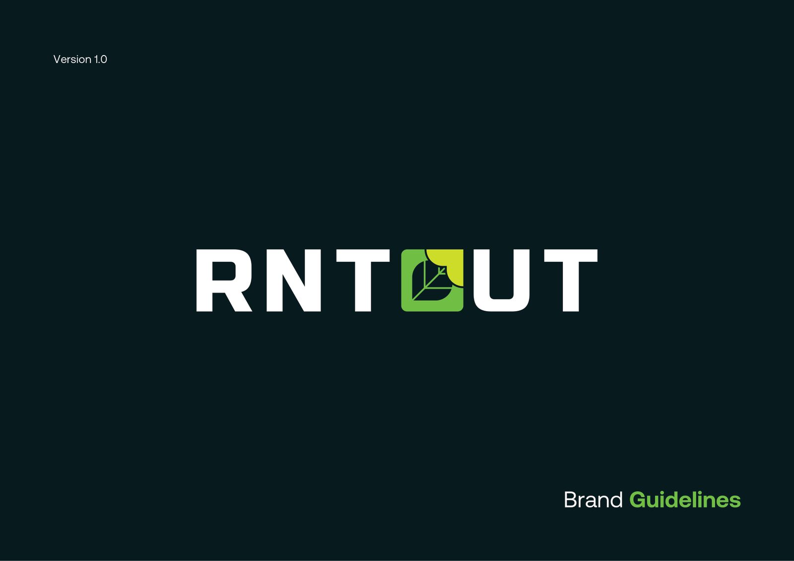
A leaf and an arrow form the O in RNTOUT: sustainability, renting out and reuse in a single mark.
- Client
- RNTOUT
- Sector
- Rentals & sustainability
- Deliverable
- Brand identity guidelines
- The mark
- Leaf + arrow = the O
01 / The brand
Sustainability,
in the O.
Renting out, reuse and the circular economy.
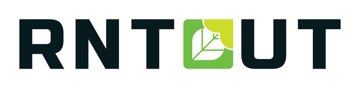
A leaf and an arrow combine to form the O in RNTOUT.
The logo features a leaf integrated into the design, symbolising the brand's commitment to sustainability and eco-friendly practices.
The arrow within the leaf represents renting out and continuous improvement, highlighting the circular economy and the efficient use of resources.
Leaf and arrow are combined to form the O in the name, visually reinforcing the brand message.
- Logo concept
- Logo variations
- Colour palette
- Typography
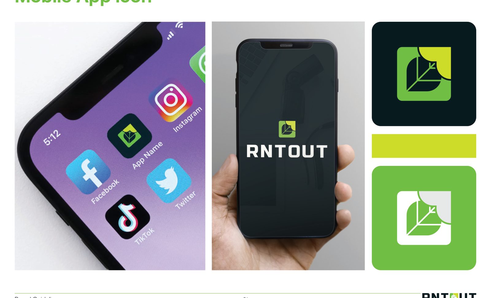
- App icon
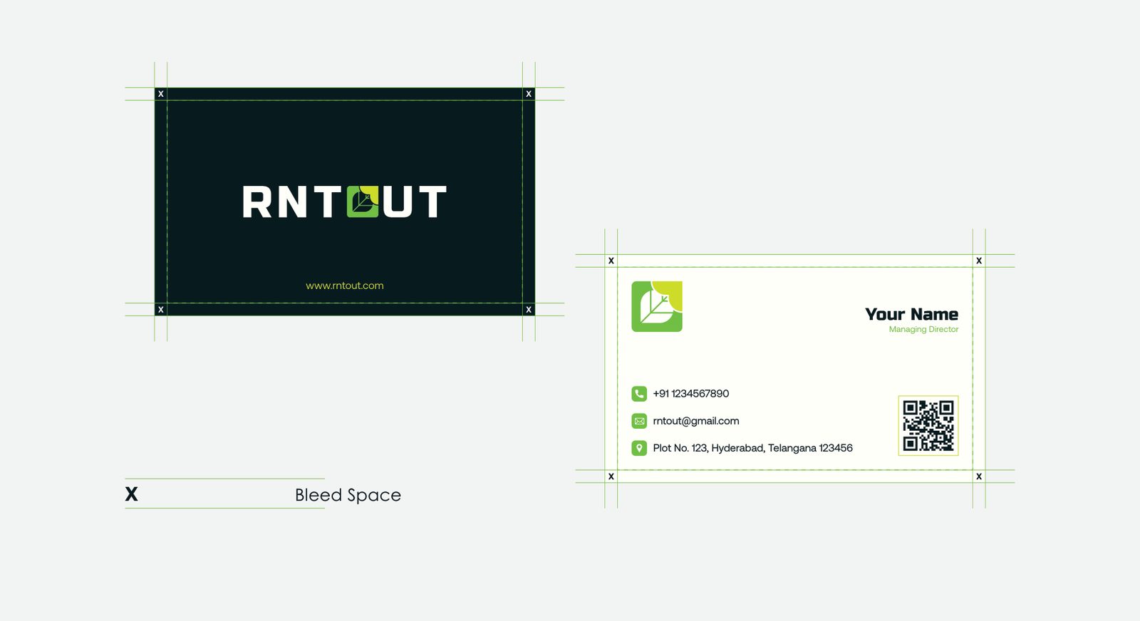
- Business card
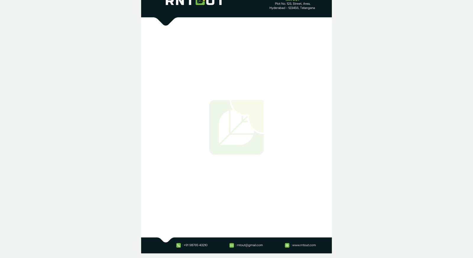
- Letterhead
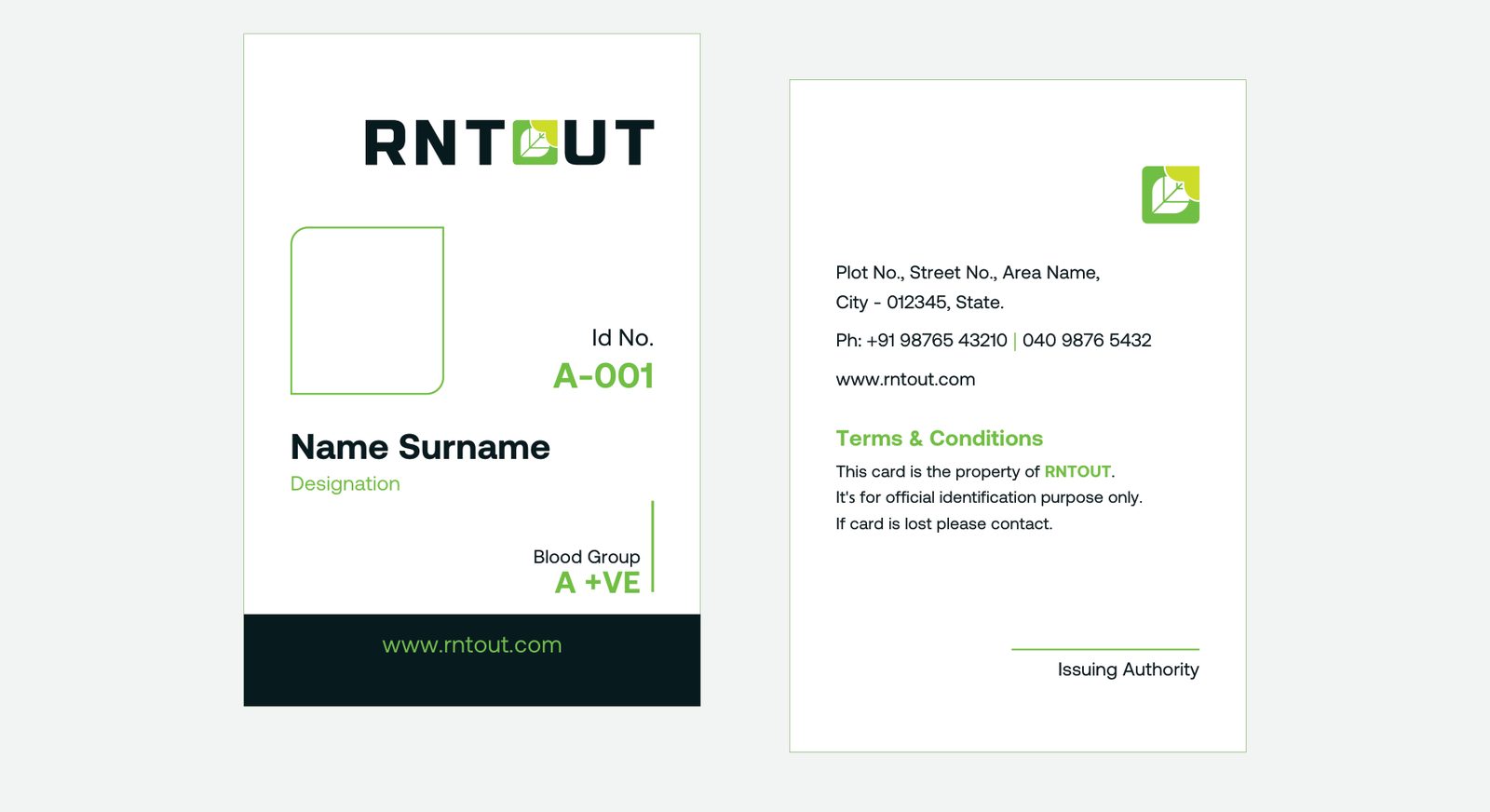
- ID card
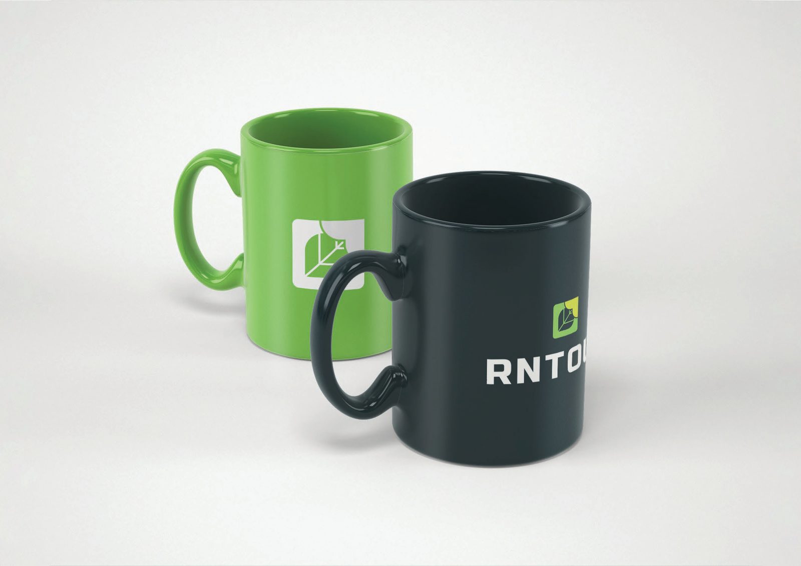
- Cup
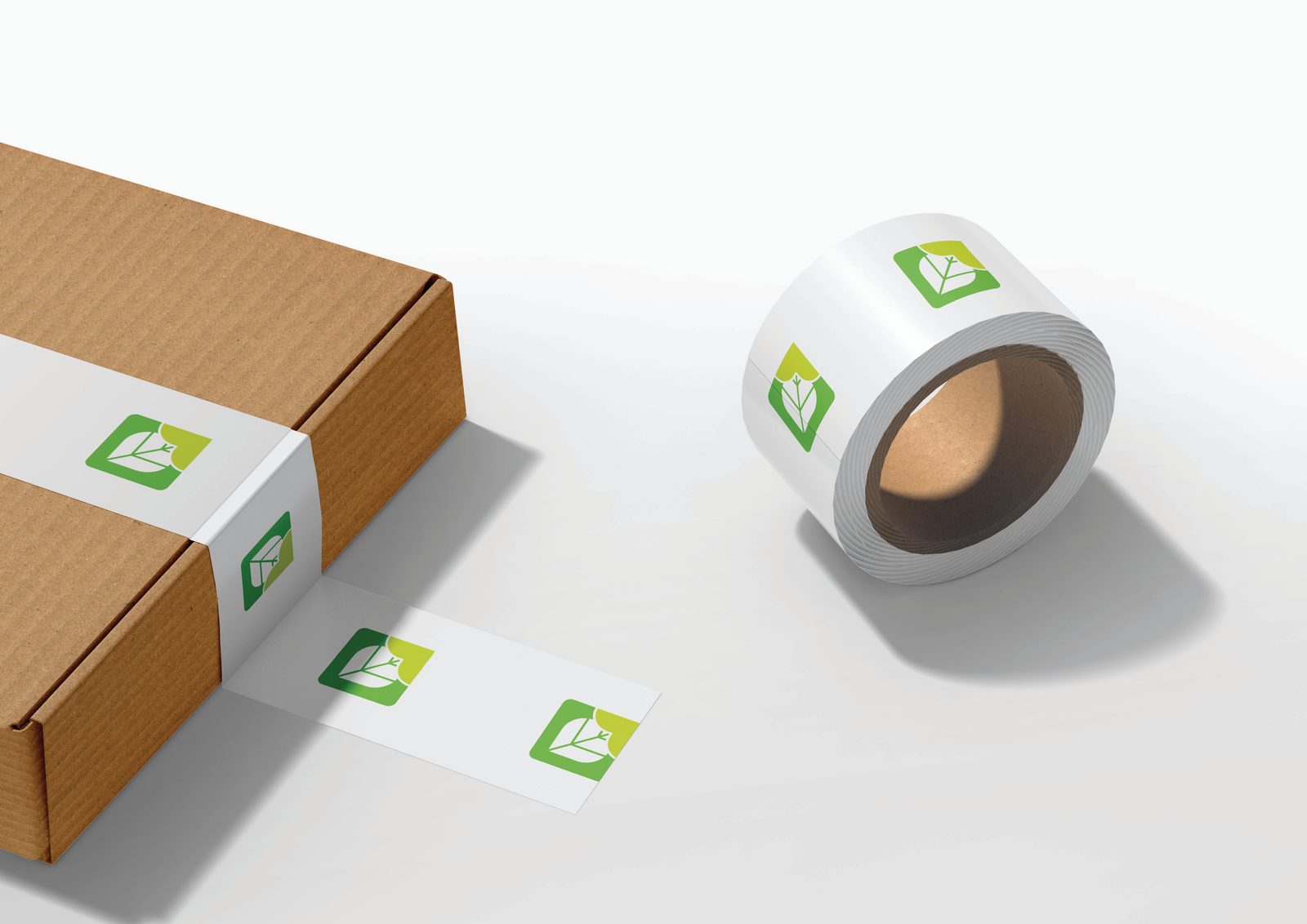
- Packaging tape
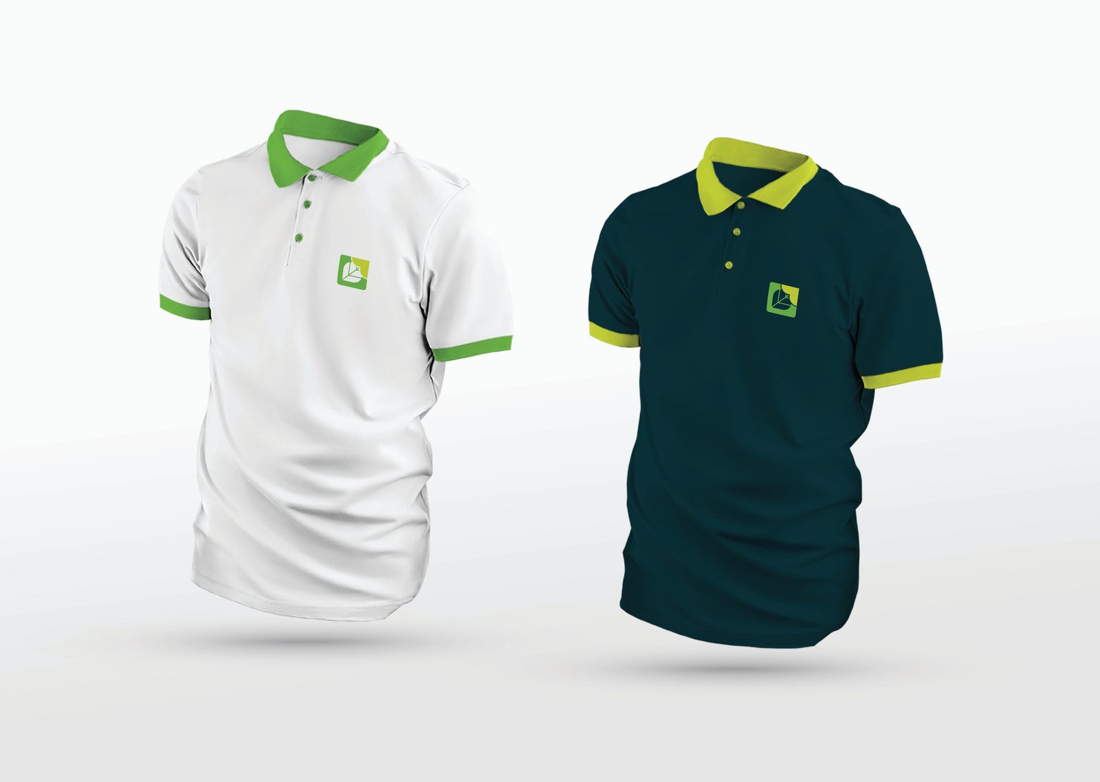
- Apparel
Logo concept
Sustainability focus
A leaf integrated into the design promotes sustainability and eco-friendly practices.
Renting out and reusability
The arrow within the leaf stands for renting out and continuous improvement.
Integrated design
Leaf and arrow together form the O in the RNTOUT name.
Green colour palette
Green reflects a dedication to sustainability, eco-consciousness and environmental responsibility.
Simple and memorable
A clean design that is easy to recognise and remember, in line with a modern, innovative identity.
02 / Identity
The mark,
up close.
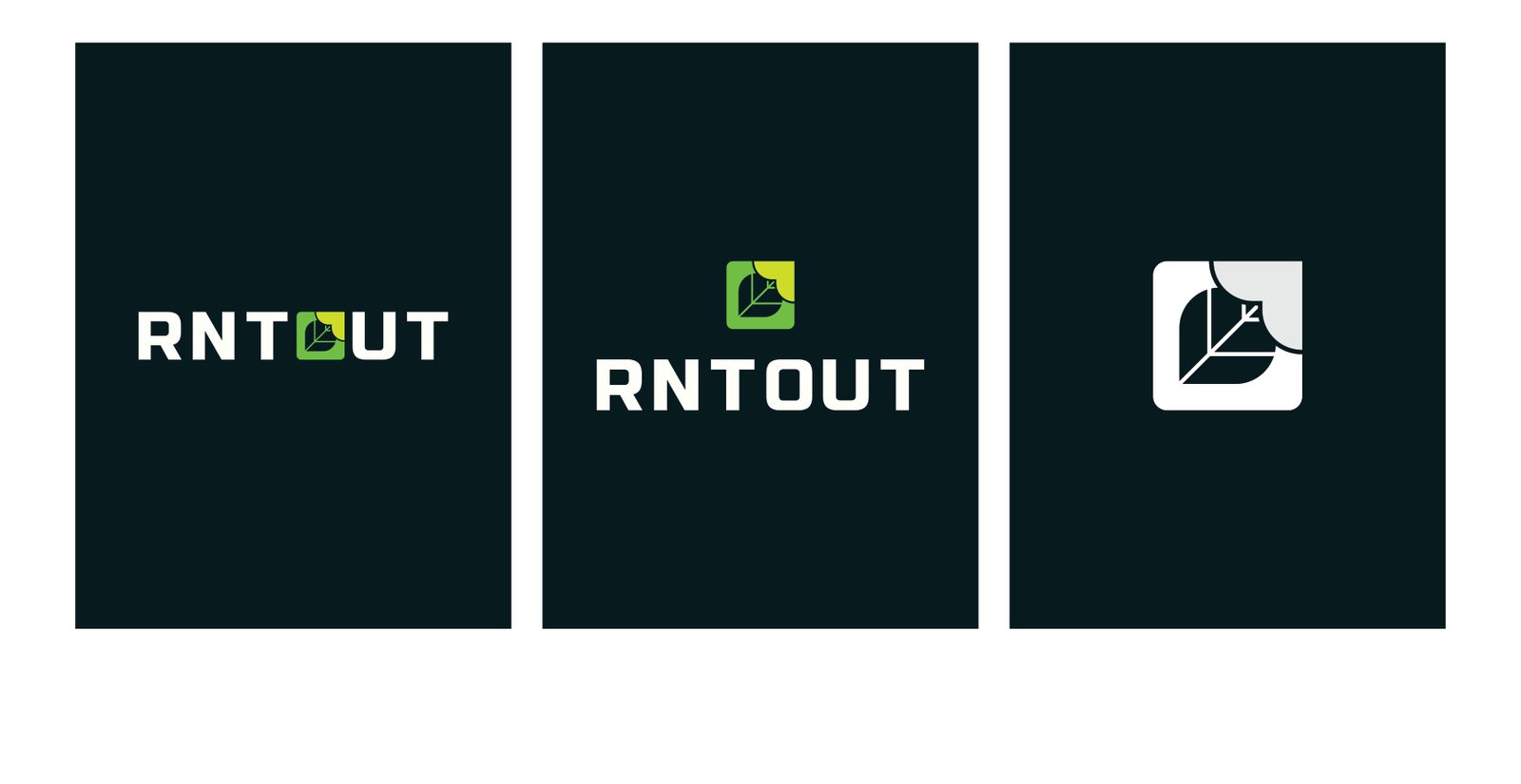
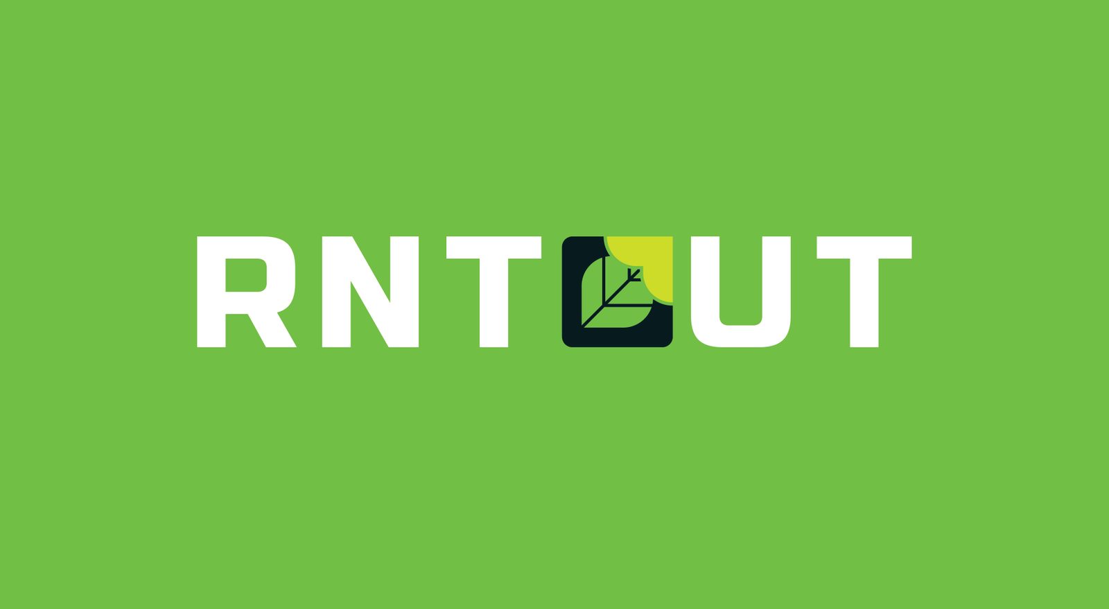
The logo and how it is meant to be used.
03 / Colour & type
Colour
& type.
The palette and typefaces that hold the identity together.
Hex #70BF44
RGB 112, 191, 68
CMYK 60, 0, 100, 0
Hex #CBDB2A
RGB 203, 219, 42
CMYK 25, 0, 100, 0
Hex #071C1F
RGB 7, 28, 31
CMYK 85, 66, 63, 76
Hex #FFFFFF
RGB 255, 255, 255
CMYK 0, 0, 0, 0
Hex #000000
RGB 0, 0, 0
CMYK 0, 0, 0, 100
04 / In use
The brand
at work.
Selected pages and applications from the RNTOUT guidelines.
Next project
ABOIN
Care.
Say hello
Let's make
something move.
For new business, collaborations or just a good conversation.
admin@demandstudio.in ↗