
Project 25 · Wellness
Nature
Wellness.
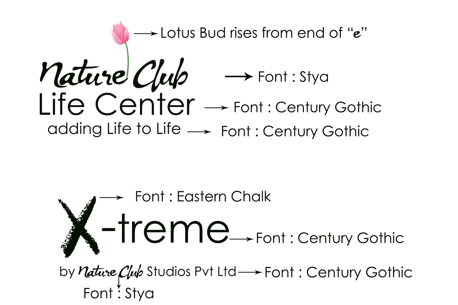
Two logos and the thinking behind them: a lotus bud that rises from the end of the “e”, set beside a chalk-textured X.
- Client
- Nature Wellness
- Sector
- Wellness
- Deliverable
- Logo & typography
- Tagline
- adding Life to Life
01 / The brand
Adding life
to life.
Nature Club Life Center and X-treme.
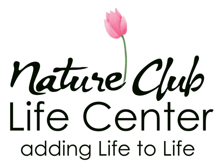
A lotus bud rises from the end of the “e”.
Nature Club Life Center carries the line “adding Life to Life”. Its wordmark is set in the brush script Stya, with a lotus bud that rises from the end of the “e” in Nature, and “Life Center” and the tagline set in Century Gothic.
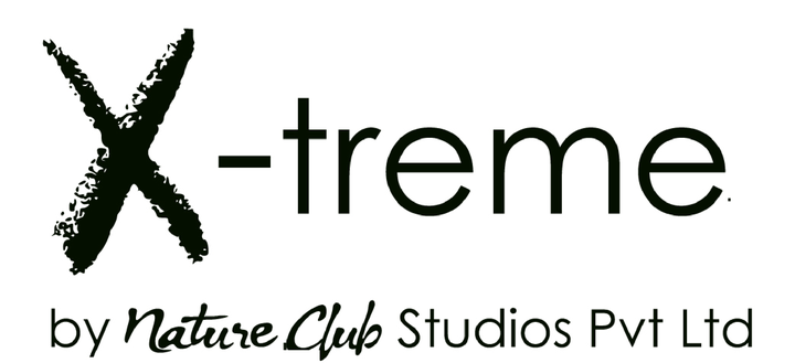
X-treme, by Nature Club Studios Pvt Ltd, pairs a chalk-textured X (Eastern Chalk) with clean Century Gothic lettering.
- Logo concept
- Typography
02 / Identity
The mark,
up close.
The logo and how it is meant to be used.
03 / Type
The
typefaces.
The typefaces behind the identity.
Next project
Paradox
Museum.
Say hello
Let's make
something move.
For new business, collaborations or just a good conversation.
admin@demandstudio.in ↗