
Project 16 · Parking
Koda
Cars.
A mark built from a steering wheel, a location pin and the letter Y.
- Client
- KodaCars
- Sector
- Parking
- Deliverable
- Identity manual
- Tagline
- Parking that pays
01 / The brand
Parking
that pays.
One mark, three ideas.
A steering wheel, a location symbol and the letter Y.
The KodaCars mark is built from three ideas: a steering wheel, a location symbol and the letter Y.
The identity manual sets out full-colour, reverse and greyscale versions of the logo, a compact icon for favicons and social profiles, and clear rules for spacing, sizing and misuse.
- Logo & construction
- Logo icon / favicon
- Colour palette
- Typography
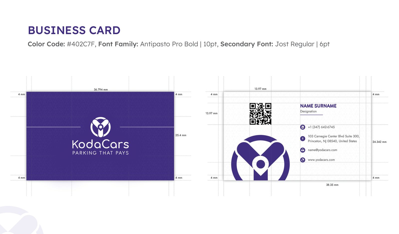
- Business card
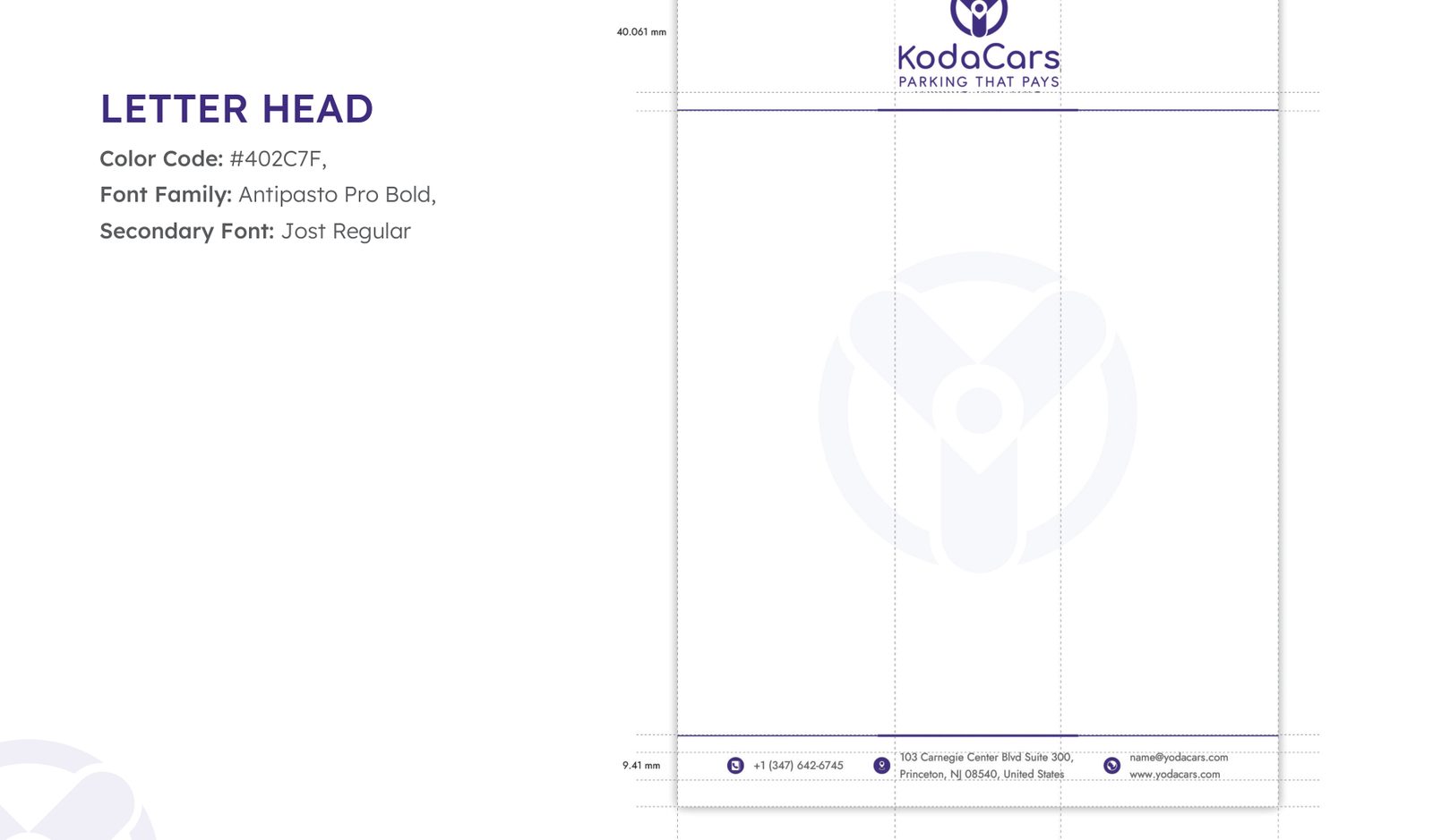
- Letterhead
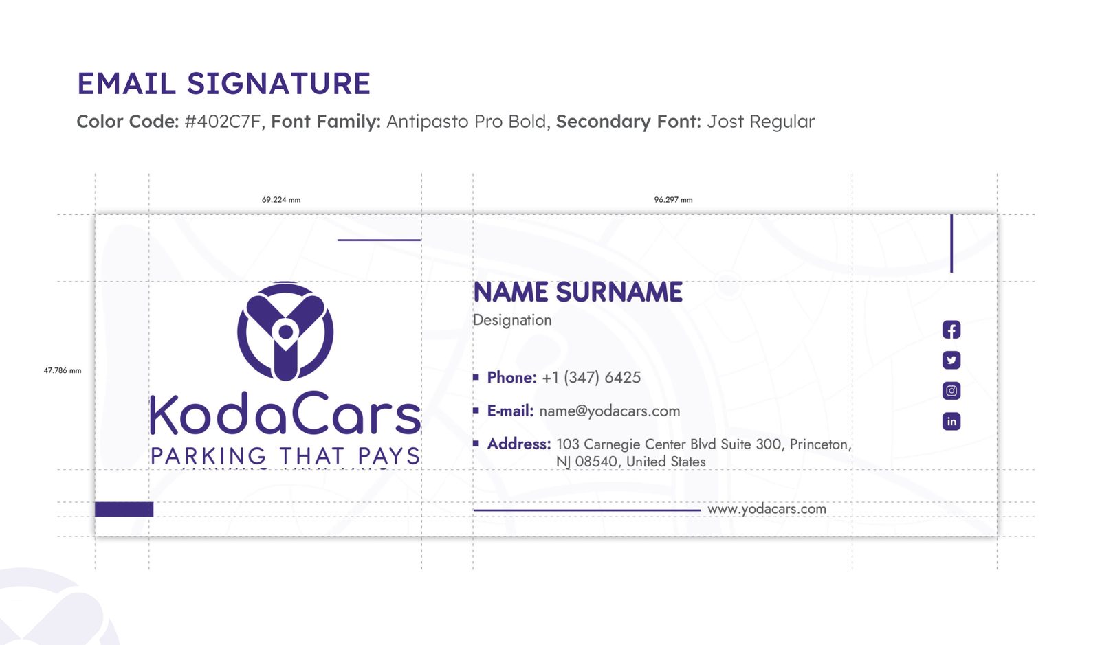
- Email signature
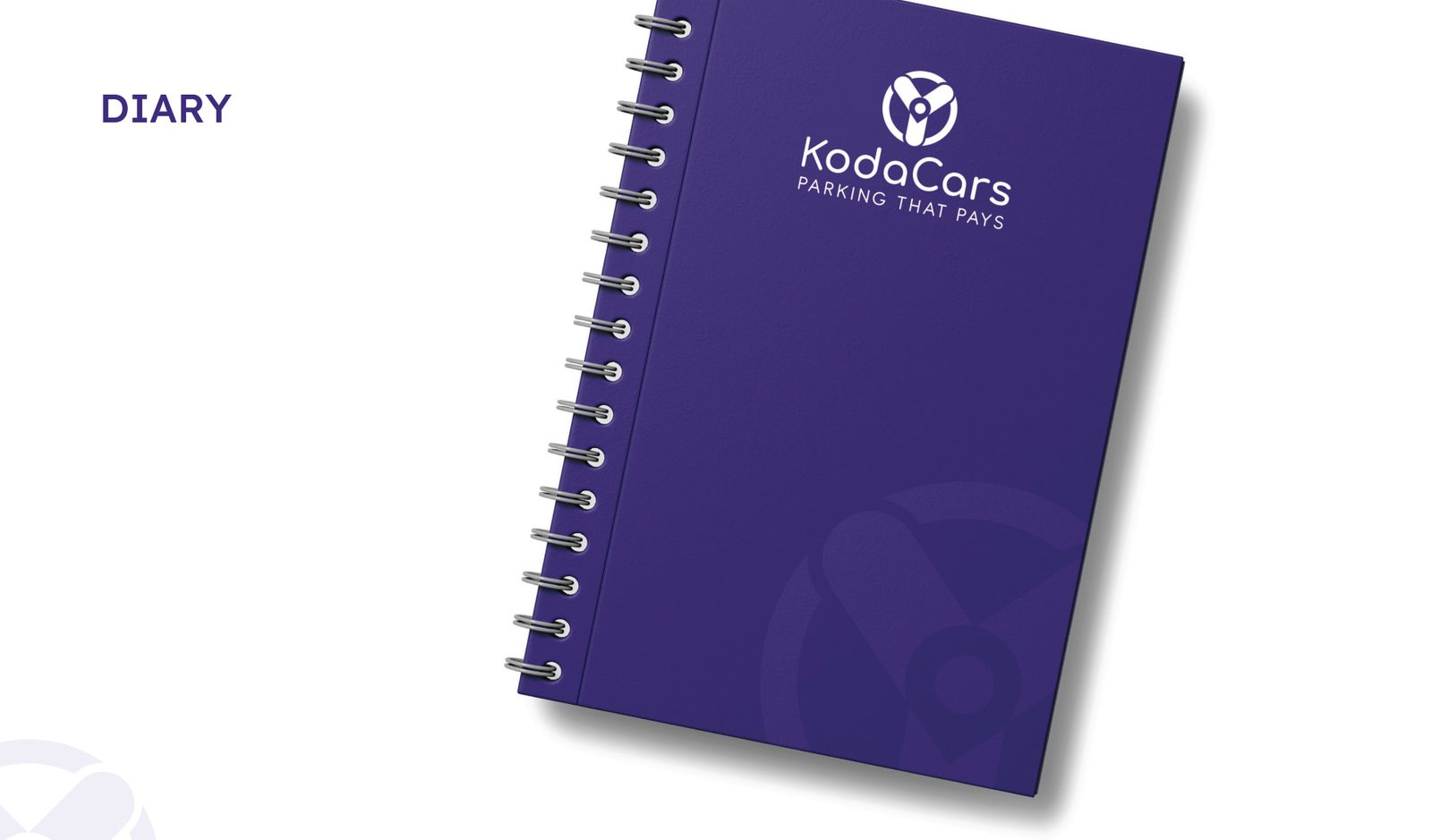
- Diary
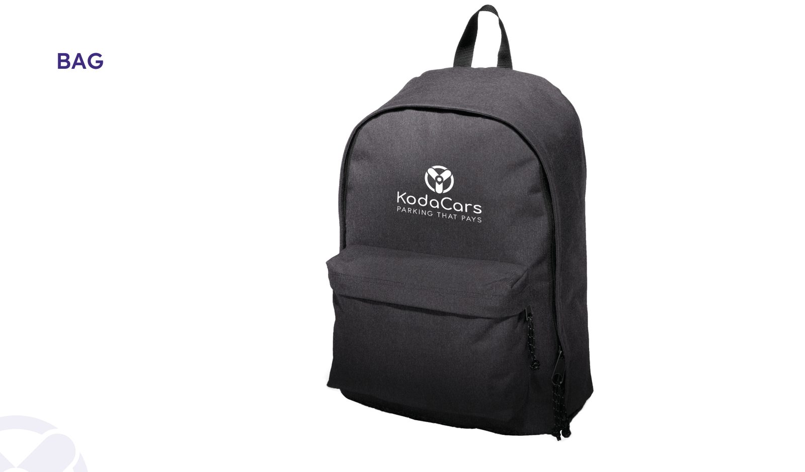
- Bag
Logo system
Full-colour logo
Used where there is ample horizontal space, with a minimum width of 75px.
Reverse logo
White on coloured or noisy backgrounds, with a minimum width of 75px.
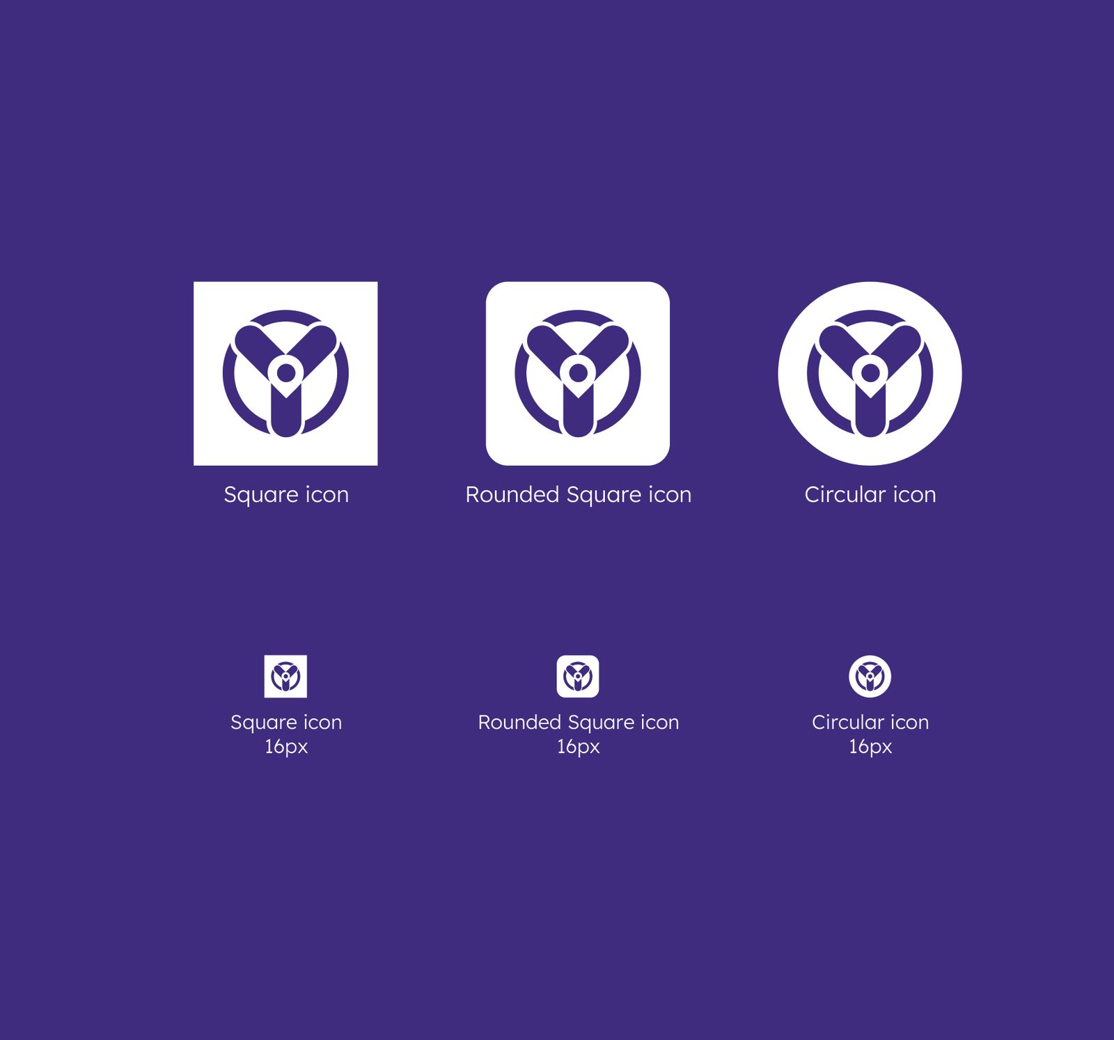
Icon / favicon
For very small spaces such as a website favicon or a social profile picture, down to 16px.
02 / Identity
The mark,
up close.
The logo and how it is meant to be used.
03 / Colour & type
Colour
& type.
The palette and typefaces that hold the identity together.
Hex #402E7F
RGB 64, 46, 127
CMYK 93, 100, 14, 4
Hex #46444C
RGB 70, 68, 76
CMYK 69, 64, 52, 39
Hex #FFFFFF
RGB 255, 255, 255
CMYK 0, 0, 0, 0
04 / In use
The brand
at work.
Selected pages from the document.
Next project
RNTOUT.
Say hello
Let's make
something move.
For new business, collaborations or just a good conversation.
admin@demandstudio.in ↗