
Project 19 · Home care products
Eco
Leaf.
A cleaning range with a logo built from the letter E and a leaf.
- Client
- Eco Leaf
- Sector
- Home care products
- Deliverable
- Brand identity guidelines
- Tagline
- Safe & extra clean
01 / The brand
Safe &
extra clean.
Environment, sustainability, freshness.
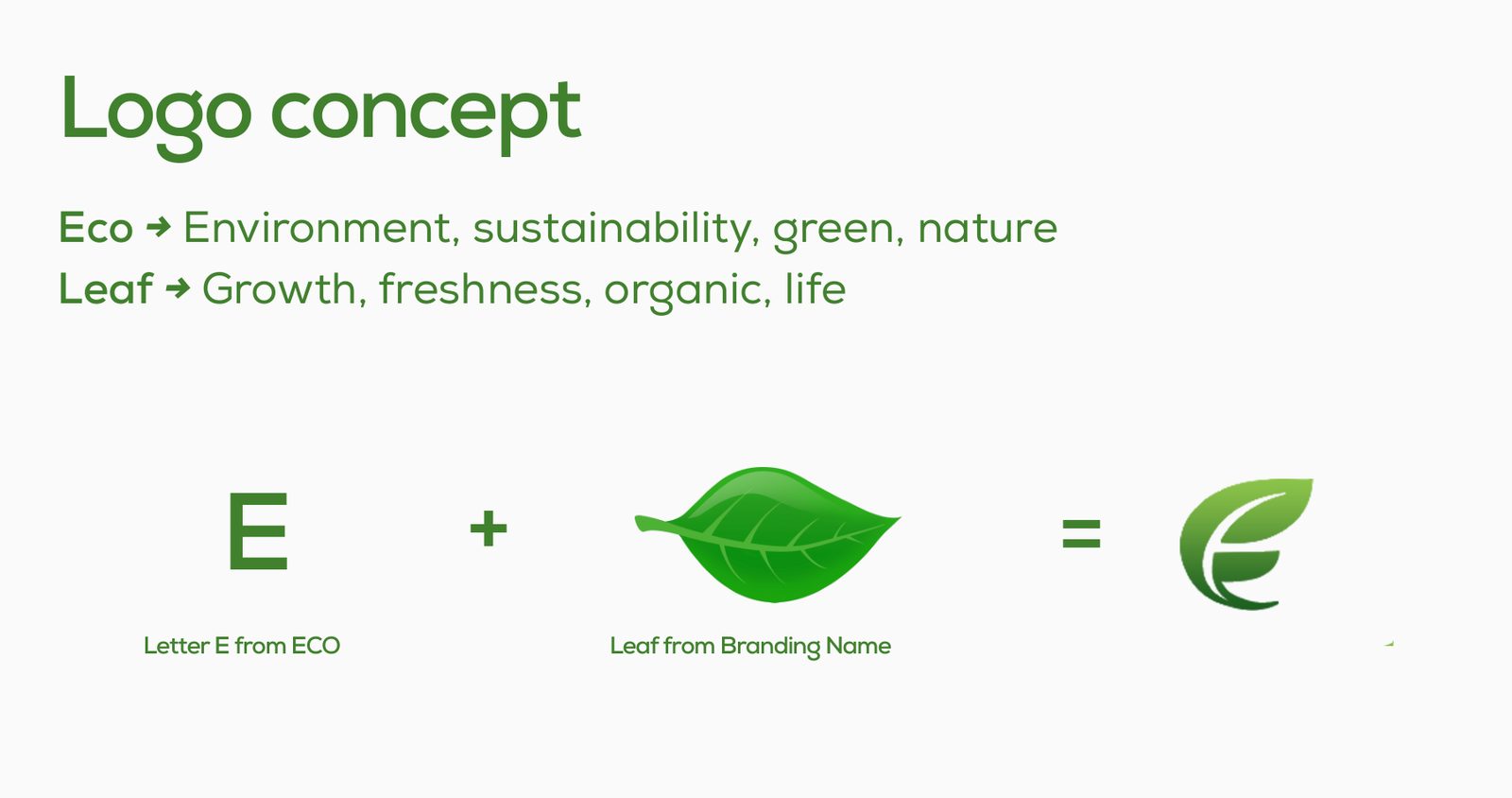
The letter E and a leaf, joined into one mark.
The Eco Leaf logo combines the letter E from “Eco” with a leaf from the brand name.
Eco stands for environment, sustainability, green and nature; the leaf stands for growth, freshness, organic and life.
- Logo concept
- Colour & typography
- Logo on colour
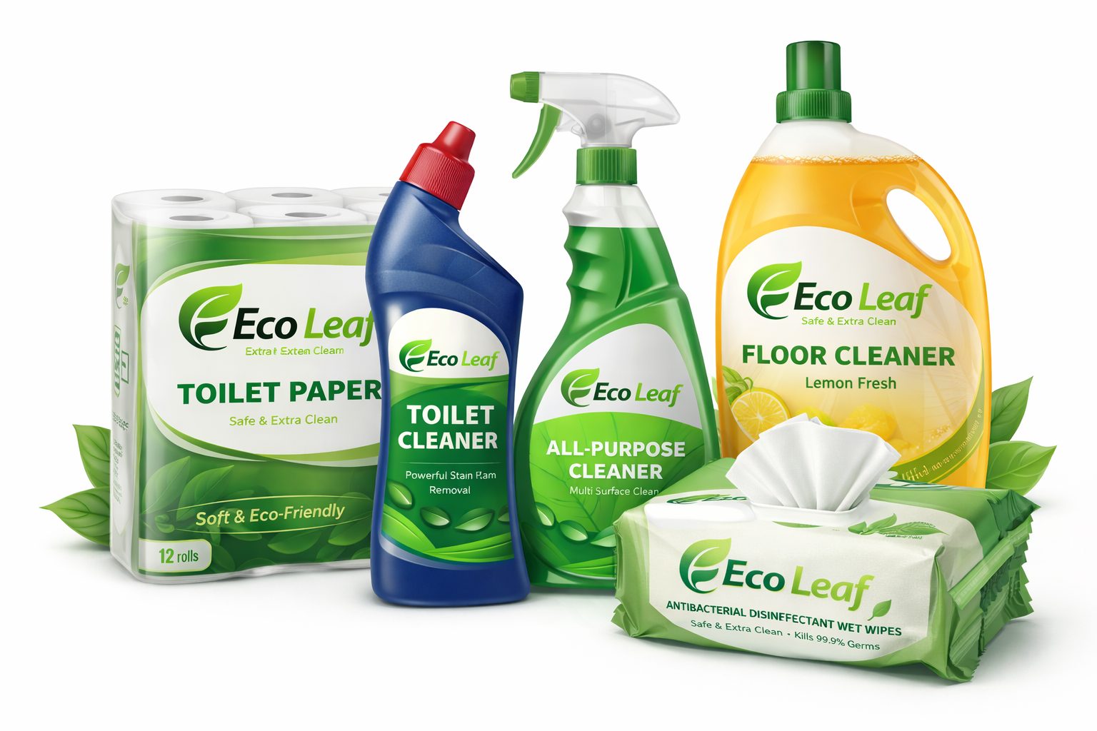
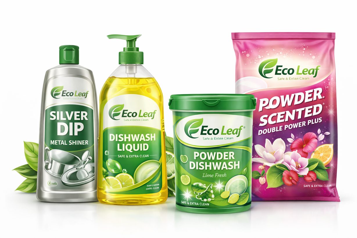
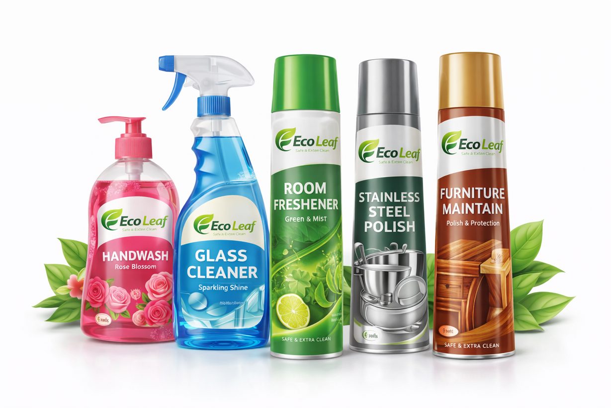
- Product mockups
Logo concept
Letter E from ECO
Eco: environment, sustainability, green, nature.
Leaf from the brand name
Leaf: growth, freshness, organic, life.
02 / Identity
The mark,
up close.
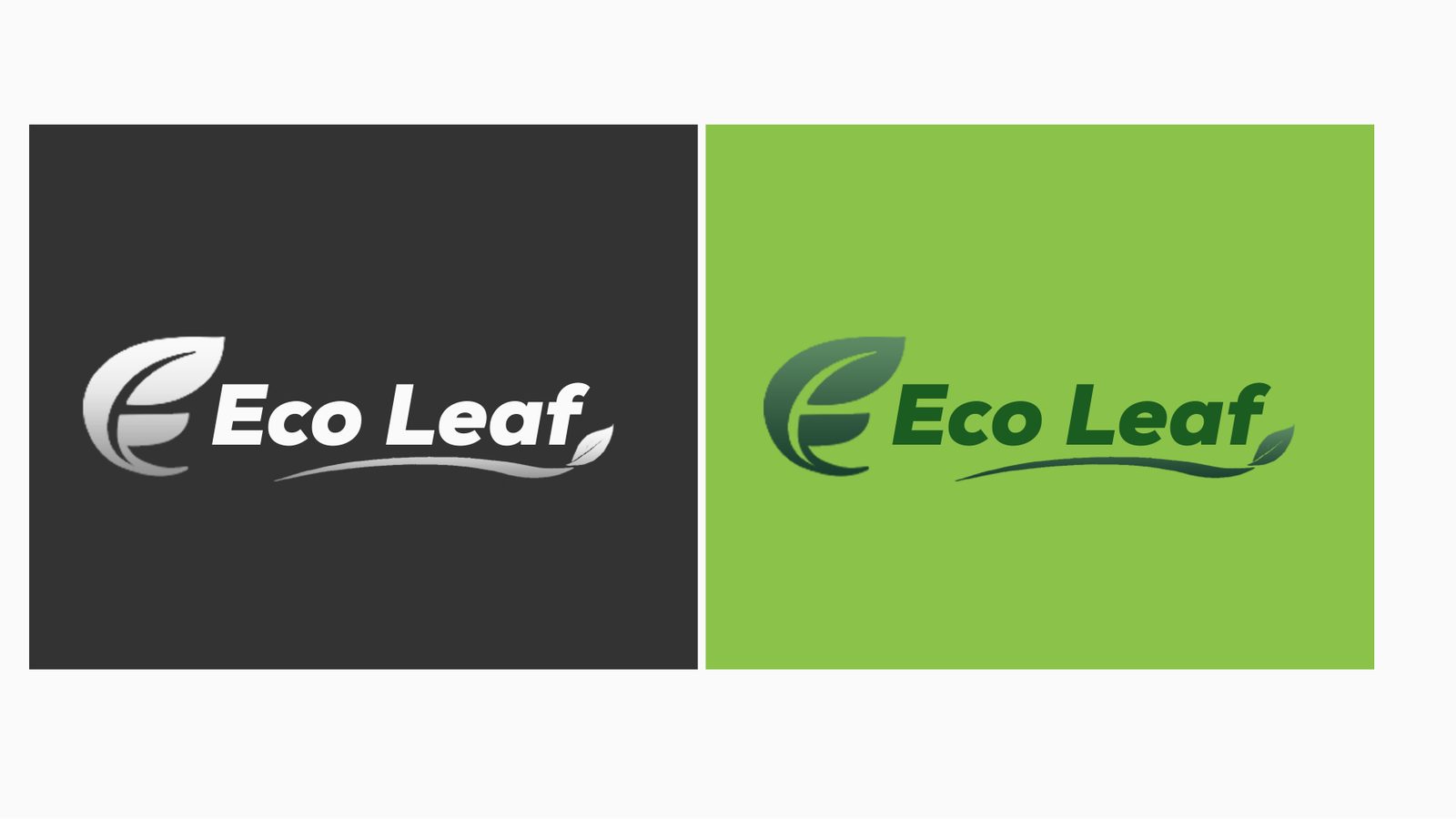
The logo and how it is meant to be used.
03 / Colour & type
Colour
& type.
The palette and typefaces that hold the identity together.
Hex #1B5E20
RGB 27, 94, 32
Hex #8BC34A
RGB 139, 195, 74
Hex #333333
RGB 51, 51, 51
04 / In use
The brand
at work.
Selected pages and applications from the Eco Leaf guidelines.
Next project
Amptronics.
Say hello
Let's make
something move.
For new business, collaborations or just a good conversation.
admin@demandstudio.in ↗